1 | \documentclass{ctexart}%中文 |
西瓜书习题3-4
参考:https://blog.csdn.net/Snoopy_Yuan/article/details/64131129
习题3.4 选择两个UCI数据集,比较10折交叉验证法和留一法所估计出的对率回归的错误率
这里从UCI分别选择了数据集Iris Data Set 和 Blood Transfusion Service Center Data Set;通过sklearn库实现,seaborns进行可视化,另外seaborns自带iris的数据集,可以直接拿来用
载入数据,预处理
1 | import numpy as np |
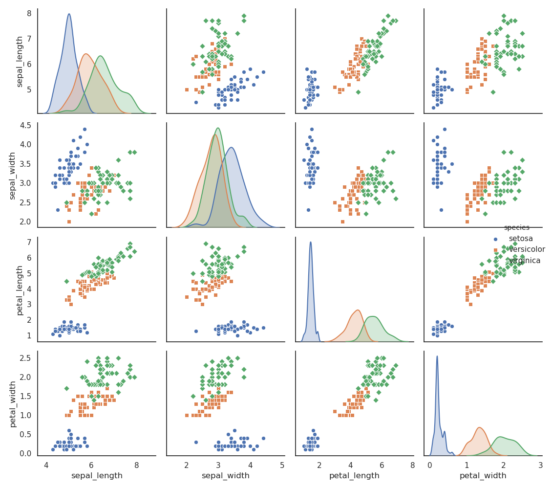
可以看到iris数据类间比较分散,也是后面测试结果比较好的原因之一
sklearn库
1 | from sklearn.linear_model import LogisticRegression |
十折交叉训练
model_selection.cross_val_predict 指定模型直接就返回测试结果
1 | y_pred_10_fold = model_selection.cross_val_predict(log_model, X, y, cv=10) |
The accuracy of 10-fold cross-validation: 0.9733333333333334留一法
留一法相当于k折交叉训练中,把k取为所有的样例数m,因此要经过m次训练,用循环来实现
1 | accuracy_LOO = 0 |
The accuracy of Leave-One-Out: 0.9666666666666667对于iris数据集,精度比较高,相应错误率较低
类似的,对Transfusion数据集可视化: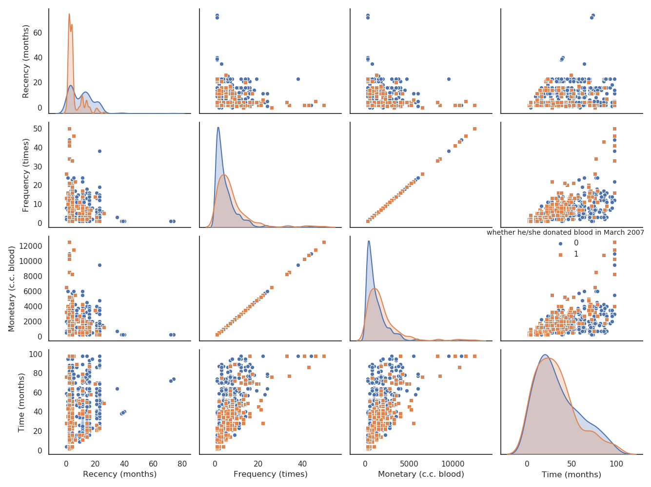
类间分散比较紧凑
相应精度:
The accuracy of 10-fold cross-validation: 0.7687165775401069
The accuracy of Leave-One-Out: 0.7700534759358288
通过以上对比,十折交叉验证法与留一法精度相差不大;而且通过实验,留一法代码跑的时间更长,对于数据越大,这种现象越明显.
因此往后,选择十折交叉验证即可满足精度要求,也节约运行成本
西瓜书习题3-3
参考:
[1]https://www.cnblogs.com/judejie/p/8999832.html
[2]https://blog.csdn.net/zouxy09/article/details/20319673
[3]https://blog.csdn.net/Snoopy_Yuan/article/details/63684219?utm_medium=distribute.pc_relevant.none-task-blog-BlogCommendFromMachineLearnPai2-2.nonecase&depth_1-utm_source=distribute.pc_relevant.none-task-blog-BlogCommendFromMachineLearnPai2-2.nonecase
完整代码:
(sklearn库实现)https://github.com/happybear1234/The-Watermelon-book-exercises/blob/master/Practical_3.3/code/Practical_3.3.py
(梯度下降实现)https://github.com/happybear1234/The-Watermelon-book-exercises/blob/master/Practical_3.3/code/Practical_3.3_self_def.py
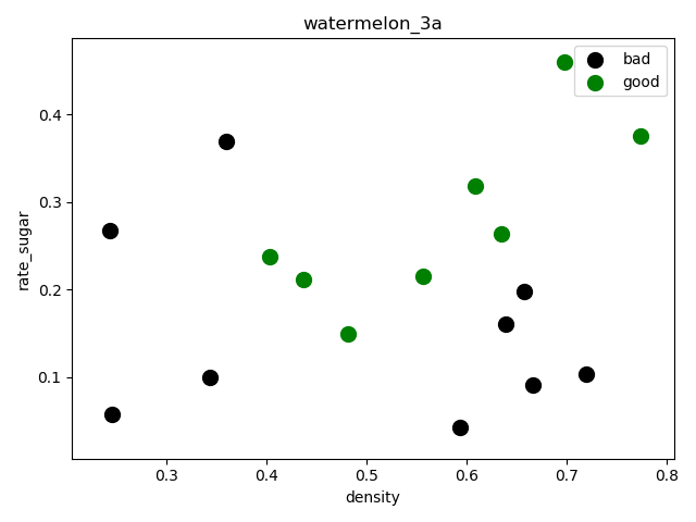
习题3.3 编程实现对率回归,并给出西瓜数据集(如下)上的结果.
| 密度 | 含糖率 | 好瓜 |
|---|---|---|
| 0.697 | 0.46 | 是 |
| 0.774 | 0.376 | 是 |
| 0.634 | 0.264 | 是 |
| 0.608 | 0.318 | 是 |
| 0.556 | 0.215 | 是 |
| 0.403 | 0.237 | 是 |
| 0.481 | 0.149 | 是 |
| 0.437 | 0.211 | 是 |
| 0.666 | 0.091 | 否 |
| 0.243 | 0.267 | 否 |
| 0.245 | 0.057 | 否 |
| 0.343 | 0.099 | 否 |
| 0.639 | 0.161 | 否 |
| 0.657 | 0.198 | 否 |
| 0.36 | 0.37 | 否 |
| 0.593 | 0.042 | 否 |
| 0.719 | 0.103 | 否 |
因此将以上数据中好瓜表示为”1”,不好的瓜表示为”0”,转换成csv文件便于读取
公式说明
基础线性模型:
$$f(x)=\omega_{1}x_{1}+\omega_{2}x_{2}…+\omega_{d}x_{d}+b$$
可转化为向量:
$$f(x)={\omega}x^T+b$$
继而令$\beta=({\omega},b)$,$\hat{x}=(x,1)$,那么(注:此处均作为行向量,与西瓜书上相反,):
$$f(x)={\omega}x^T+b={\beta}\hat{x}^T$$
为了解决此处的二分类问题,将预测值映射成$y\in{0,1}$的值,即将线性回归转化为逻辑回归,常常采用以下的对数几率函数(sigmoid函数)代替:
$$y=\frac{1}{1+e^{-\beta\hat{x}^T}}$$
因此,只要求得$\omega$和$b$的值即可,以下通过极大似然法来估计$\omega$和$b$的值:
$$\psi(\beta)=\sum_{i=1}^{m}(y_{i}\beta\hat{x}^T_{i}-ln(1+e^{\beta\hat{x}^T_{i}}))$$
将上式最大化转化为最小化,便于后面梯度下降求解,如西瓜书P59公式3.27:
$$\psi(\beta)=\sum_{i=1}^{m}(-y_{i}\beta\hat{x}^T_{i}+ln(1+e^{\beta\hat{x}^T_{i}}))$$
该函数为连续可导凸函数(对应海塞矩阵正定),因此可用梯度下降求得最优解,梯度为:
$$\frac{\varphi\psi(\beta)}{\varphi\beta}=\sum_{i=1}^{m}(-y_{i}+\frac{1}{1+e^{-\beta\hat{x}^T}})\hat{x}_{i}$$
迭代过程(其中$\lambda$为步长)为:
$$\beta^{t+1}=\beta^{t}-\lambda\frac{\varphi\psi(\beta)}{\varphi\beta}$$
sklearn库实现
载入数据,预处理
1 | import numpy as np |
(17, 2)绘制分散图,查看数据分散情况:
1 | f1 = plt.figure(1) |
sklearn逻辑回归库拟合
调用sklearn中的逻辑回归模型进行训练和预测
1 | from sklearn import model_selection |
打印混淆矩阵和相关度量,结果如下:
1 | print(metrics.confusion_matrix(y_test, y_pred)) |
[[3 2]
[1 3]]
precision recall f1-score support
0.0 0.75 0.60 0.67 5
1.0 0.60 0.75 0.67 4
accuracy 0.67 9
macro avg 0.68 0.68 0.67 9
weighted avg 0.68 0.67 0.67 9这里选择的留出法抽取样本,因为样本比较少,拟合效果一般,预测精度只有67%,可以采用自助法或者交叉验证法重新抽样,进一步选择最优模型
绘制决策边界
1 | f2 = plt.figure(2) |
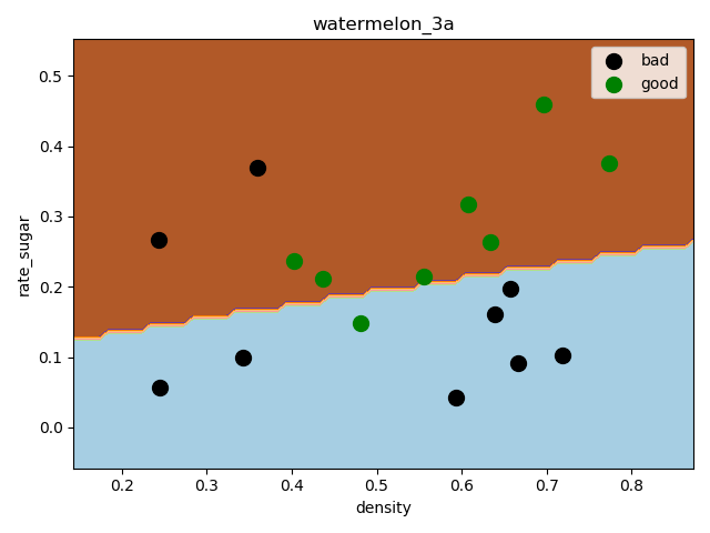
可以看出训练出来的分类器还是可以分类出大多数示例
梯度下降法实现
实现以上公式
1 | # 1)实现 P59 公式3.27极大似然法 |
这里采用批量梯度下降法:
1 | def gradDscent(X, y, alpha, iterations, n): |
绘制收敛曲线
1 | def showConvergCurve(Iterations, Cost): |
这里步长取得0.1,迭代次数1500,在800次迭代后趋于稳定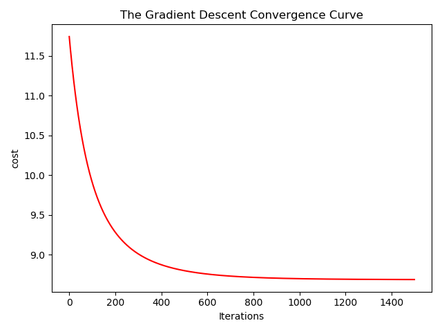
绘制决策边界
1 | def showLogRegression(X, y, Beta, N): |
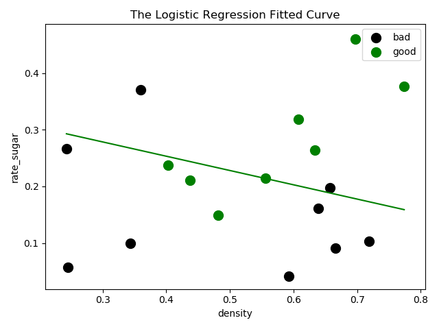
看上去并没有sklearn库中逻辑回归分类器效果好,但是计算出来的精度却比分类器要高(这里为了方便没有划分数据集,可以重新用sklearn分好的数据再做对比)
测试
1 | def testLogRegres(Beta, test_x, test_y): |
The classify accuracy is: 70.588%西瓜书习题1.2
参考https://blog.csdn.net/yuzeyuan12/article/details/83113461
- 1.2 与使用单个合取式来进行假设表示相比,使用“析合范式”将使得假设空间具有更强的表示能力。若使用最多包含k个合取式的析合范式来表达表1.1的西瓜分类问题的假设空间,试估算有多少种可能的假设。
表1.1显示 色泽:二种,根蒂:三种,敲声:三种;因此析取范式共有(不含空集):3*4*4=48;特征集共有:2*3*3=18.
此题关键点是去冗余操作,因为特征集最多为18,析合范式里去冗余后的析取范式也不会超过18;因此用一个18维向量就可以全部表示出去冗余后的所有取值,其中18维向量中全为1时,表示至多的情况;全为0时为初始值
- 代码:
1
2
3
4
5
6
7
8
9
10
11
12
13
14
15
16
17
18
19
20
21
22
23
24
25
26
27
28
29
30
31
32
33
34
35
36
37
38
39
40
41
42
43
44
45
46
47
48
49
50
51
52
53
54
55
56
57
58
59
60
61
62
63
64
65
66
67
68
69
70
71
72
73
74
75
76
77
78
79
80import numpy as np
import itertools as it
import datetime
""""
1) 从 0-47 中抽取 k 个组合 sample_combin
2) 将 sample_combin 中的元素依次转换成三维 (3,4,4) 中的对应坐标 coord_3
3) 将 coord_3 再依次转换成 0/1 二值形式的 18 维向量 vector_18,并依次添加到列表 vector 做去冗余操作
4) 把 vector 映射到 1-2^18 对应数值 num,并依次添加到集合 num_set 筛选重复的数
5) 最后 num_set 的长度即为最终要求的结果
"""
# 数值转换成三维(3,4,4)
def turn_48_to_coord_3(num):
for i in range(3):
for j in range(4):
for k in range(4):
if i * 16 + j * 4 + k == num:
return [i + 1,j + 1,k + 1]
# 三维(3,4,4)转换成 18 维向量
def coord_3_to_18(coord_3):
vector_18 = np.zeros([2,3,3])
# 如果色泽为 *
if coord_3[0] == 3:
coord_3[0] = [1, 2]
else:
coord_3[0] = [coord_3[0]]
# 如果根蒂为 *
if coord_3[1] == 4:
coord_3[1] = [1, 2, 3]
else:
coord_3[1] = [coord_3[1]]
# 如果敲声为 *
if coord_3[2] == 4:
coord_3[2] = [1, 2, 3]
else:
coord_3[2] = [coord_3[2]]
for x in coord_3[0]:
for y in coord_3[1]:
for z in coord_3[2]:
# 映射到 18 维向量的值为 1 表示相应特征
vector_18[x-1][y-1][z-1] = 1
return vector_18
# 获得 0-48 数值转换成 18 维向量的结果
def get_48_to_18(num):
coord_3 = turn_48_to_coord_3(num)
vector_18 = coord_3_to_18(coord_3)
return vector_18
def main(k):
num_set = []
# 从 0-47 中抽取 k 个组合
for sample_combin in it.combinations(range(48),k):
vector = []
for i in range(k):
vector_18 = get_48_to_18(sample_combin[i])
vector.append(vector_18)
vector = np.array(vector)
vector = vector.any(axis=0) # 去冗余操作:按第一个轴方向取或
vector = np.reshape(vector,[18])
vector = vector.tolist()
num = 0
for i in range(18):
num += 2 ** i * vector[i] # 0/1 二值 18 维映射成 1-2^18 十进制
num_set.append(num)
if len(num_set) > 5000000:
num_set = list(set(num_set)) # 长度大于 500W 时取一次集合,防止数组太长导致程序崩溃
# 最后取一次集合
num_set = list(set(num_set))
end_time1 = datetime.datetime.now()
print('k=%d时: %d examples' %(k, len(num_set)))
print(' 用时:', end_time1 - start_time1)
start_time0 = datetime.datetime.now()
for k in range(1,18):
start_time1 = datetime.datetime.now()
main(k)
end_time0 = datetime.datetime.now()
print('一共用时',end_time0 - start_time0) - 运行结果:
k=1时: 48 examples
k=2时: 879 examples用时: 0:00:00.001208
k=3时: 8223 examples用时: 0:00:00.034517
k=4时: 40911 examples用时: 0:00:00.668103
k=5时: 112962 examples用时: 0:00:09.143752
k=6时: 193998 examples用时: 0:01:35.084796
k=7时: 233640 examples用时: 0:13:07.760253用时: 1:28:37.023360
由于是穷举法:不去冗余穷举次数$\sum_{i=1}^{k}C^{k}_{48}=(1+1)^k$(二项式定理),随着k越大,计算量也更大,从运行耗时就能看出
Datawhale零基础入门数据挖掘-Task5
- 对于多种调参完成的模型进行模型融合
- 简单加权融合:
- 回归(分类概率):算术平均融合(Arithmetic mean),几何平均融合(Geometric mean);
- 分类:投票(Voting)
- 综合:排序融合(Rank averaging),log融合
- stacking/blending:
- 构建多层模型,并利用预测结果再拟合预测。
- boosting/bagging(在xgboost,Adaboost,GBDT中已经用到):
- 多树的提升方法
1 | import numpy as np |
Datawhale零基础入门数据挖掘-Task4
- 了解常用的机器学习模型,并掌握机器学习模型的建模与调参流程
相关原理
线性回归模型
https://zhuanlan.zhihu.com/p/49480391
决策树模型
https://zhuanlan.zhihu.com/p/65304798
GBDT模型
https://zhuanlan.zhihu.com/p/45145899
XGBoost模型
https://zhuanlan.zhihu.com/p/86816771
LightGBM模型
https://zhuanlan.zhihu.com/p/89360721
教材推荐
- 《机器学习》 https://book.douban.com/subject/26708119/
- 《统计学习方法》 https://book.douban.com/subject/10590856/
- 《Python大战机器学习》 https://book.douban.com/subject/26987890/
- 《面向机器学习的特征工程》 https://book.douban.com/subject/26826639/
- 《数据科学家访谈录》 https://book.douban.com/subject/30129410/
读取数据
1 | # reduce_mem_usage 函数通过调整数据类型,帮助我们减少数据在内存中占用的空间 |
Memory usage of dataframe is 62099672.00 MB
Memory usage after optimization is: 16520303.00 MB
Decreased by 73.4%1 | # 返回 x in sample_feature.columns not include ['price','brand','model','brand'] 的列表 |
线性回归 & 五折交叉验证 & 模拟真实业务情况
1 | sample_feature = sample_feature.dropna().replace('-', 0).reset_index(drop=True) |
简单建模
1 | from sklearn.linear_model import LinearRegression |
intercept:-110670.68277241504
[('v_6', 3367064.3416418717),
('v_8', 700675.5609398251),
('v_9', 170630.27723215616),
('v_7', 32322.661931980558),
('v_12', 20473.670796988994),
('v_3', 17868.07954151303),
('v_11', 11474.9389967116),
('v_13', 11261.764560019501),
('v_10', 2683.9200906064084),
('gearbox', 881.8225039250154),
('fuelType', 363.9042507216036),
('bodyType', 189.60271012073036),
('city', 44.94975120522736),
('power', 28.553901616752857),
('brand_price_median', 0.5103728134078609),
('brand_price_std', 0.4503634709263256),
('brand_amount', 0.14881120395065583),
('brand_price_max', 0.0031910186703138638),
('SaleID', 5.355989919860593e-05),
('offerType', 4.397239536046982e-06),
('train', 2.7939677238464355e-07),
('seller', -2.873130142688751e-07),
('brand_price_sum', -2.175006868187596e-05),
('name', -0.0002980012713074109),
('used_time', -0.002515894332880479),
('brand_price_average', -0.404904845101148),
('brand_price_min', -2.2467753486888244),
('power_bin', -34.42064411727887),
('v_14', -274.7841180777388),
('kilometer', -372.89752666073025),
('notRepairedDamage', -495.1903844628239),
('v_0', -2045.0549573558887),
('v_5', -11022.98624082137),
('v_4', -15121.731109860013),
('v_2', -26098.29992055148),
('v_1', -45556.18929726381)]1 | from matplotlib import pyplot as plt |
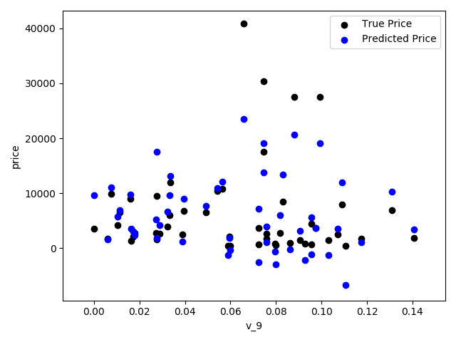
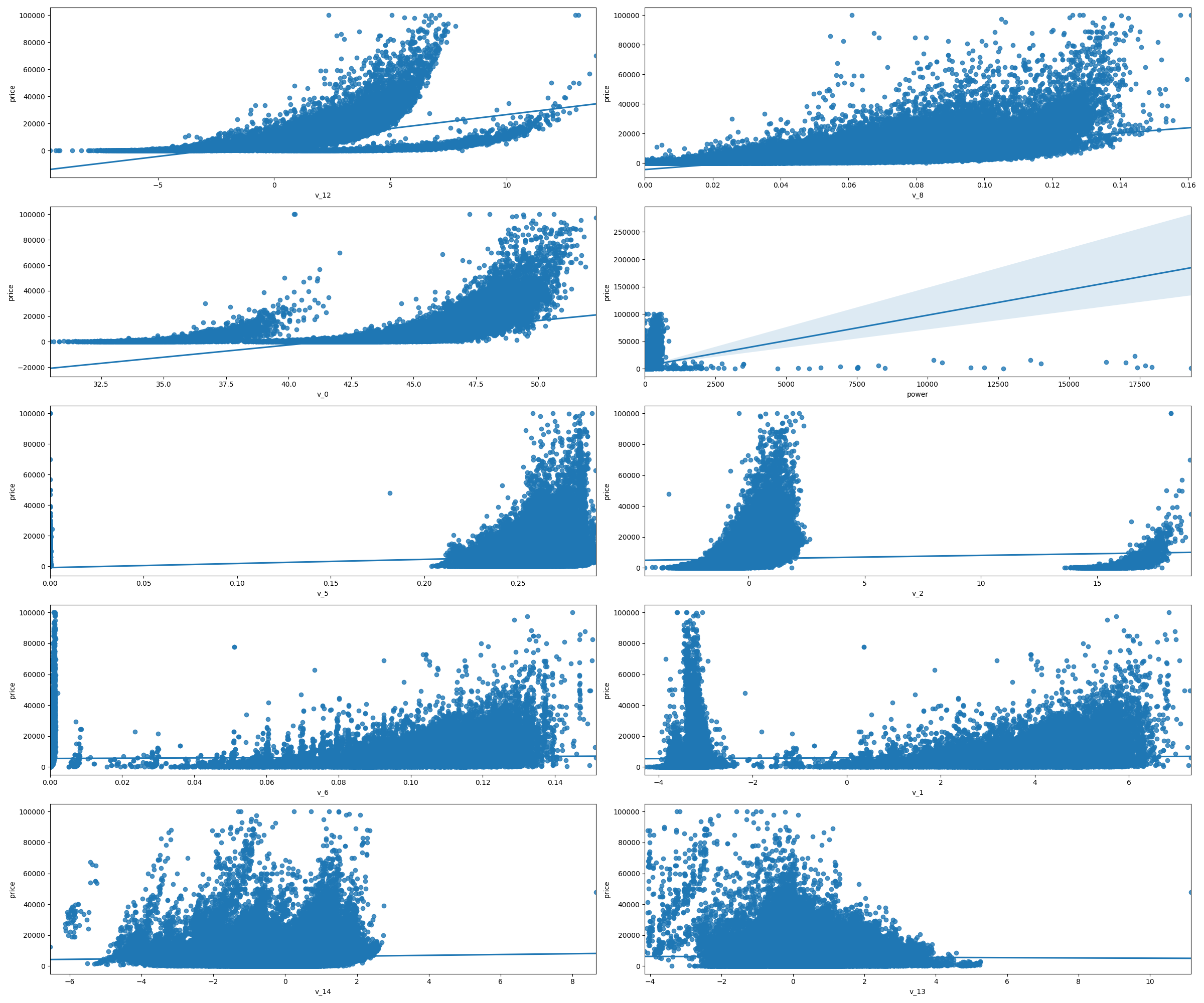
- 通过作图我们发现数据的标签(price)呈现长尾分布,不利于我们的建模预测。原因是很多模型都假设数据误差项符合正态分布,而长尾分布的数据违背了这一假设。参考博客:https://blog.csdn.net/Noob_daniel/article/details/76087829
1 | import seaborn as sns |
1 | # 在这里我们对标签进行了 log(x+1) 变换,使标签贴近于正态分布 |
1 | model = model.fit(train_X, train_y_ln) |
intercept:18.750748443060488
[('v_9', 8.052410408822315),
('v_5', 5.764240780403914),
('v_12', 1.618206098241706),
('v_1', 1.479831064546508),
('v_11', 1.166900417358536),
('v_13', 0.9404706327194452),
('v_7', 0.7137281645215736),
('v_3', 0.6837863827349204),
('v_0', 0.00850050520973589),
('power_bin', 0.008497968353528977),
('gearbox', 0.007922378343285602),
('fuelType', 0.006684768936305926),
('bodyType', 0.004523520651791603),
('power', 0.0007161895389359644),
('brand_price_min', 3.334354528992352e-05),
('brand_amount', 2.897880289491835e-06),
('brand_price_median', 1.2571187771074404e-06),
('brand_price_std', 6.659170007178332e-07),
('brand_price_max', 6.194957302457314e-07),
('brand_price_average', 5.999348706659352e-07),
('SaleID', 2.1194159119234957e-08),
('seller', 1.6262902136077173e-10),
('offerType', 1.1036149771825876e-10),
('train', 6.707523425575346e-12),
('brand_price_sum', -1.5126514245669237e-10),
('name', -7.015511195846627e-08),
('used_time', -4.122477016270915e-06),
('city', -0.002218783709616053),
('v_14', -0.004234189820672137),
('kilometer', -0.013835867353556136),
('notRepairedDamage', -0.27027942480393996),
('v_4', -0.8315697362911634),
('v_2', -0.9470821267759207),
('v_10', -1.6261468392032863),
('v_8', -40.34300817115224),
('v_6', -238.79035497319248)]1 | #再次进行可视化,发现预测结果与真实值较为接近,且未出现异常状况 |
五折交叉验证
在使用训练集对参数进行训练的时候,经常会发现人们通常会将一整个训练集分为三个部分(比如mnist手写训练集)。一般分为:训练集(train_set),评估集(valid_set),测试集(test_set)这三个部分。这其实是为了保证训练效果而特意设置的。其中测试集很好理解,其实就是完全不参与训练的数据,仅仅用来观测测试效果的数>>据。而训练集和评估集则牵涉到下面的知识了。
因为在实际的训练中,训练的结果对于训练集的拟合程度通常还是挺好的(初始条件敏感),但是对于训练集之外的数据的拟合程度通常就不那么令人满意了。因此我们通常并不会把所有的数据集都拿来训练,而是分出一部分来(这一部分不参加训练)对训练集生成的参数进行测试,相对客观的判断这些参数对训练集之外的数据的符合程度。这种思想就称为交叉验证(Cross Validation)
1 | ##使用线性回归模型,对未处理标签的特征数据进行五折交叉验证 |
[Parallel(n_jobs=1)]: Using backend SequentialBackend with 1 concurrent workers.
[Parallel(n_jobs=1)]: Done 5 out of 5 | elapsed: 0.7s finished1 | print('AVG:', np.mean(scores)) |
AVG: 1.36580240277483571 | #使用线性回归模型,对处理过标签的特征数据进行五折交叉验证( |
[Parallel(n_jobs=1)]: Using backend SequentialBackend with 1 concurrent workers.
[Parallel(n_jobs=1)]: Done 5 out of 5 | elapsed: 0.8s finished1 | print('AVG:', np.mean(scores)) |
AVG: 0.193253017539405021 | scores = pd.DataFrame(scores.reshape(1,-1)) |
| cv1 | cv2 | cv3 | cv4 | cv5 | |
|---|---|---|---|---|---|
| MAE | 0.190792 | 0.193758 | 0.194132 | 0.191825 | 0.195758 |
模拟真实业务情况
但在事实上,由于我们并不具有预知未来的能力,五折交叉验证在某些与时间相关的数据集上反而反映了不真实的情况。通过2018年的二手车价格预测2017年的二手车价格,这显然是不合理的,因此我们还可以采用时间顺序对数据集进行分隔。在本例中,我们选用靠前时间的4/5样本当作训练集,靠后时间的1/5当作验证集,最终结果与五折交叉验证差距不大
1 | # 采用时间顺序对数据集进行分隔 选用靠前时间的4/5样本当作训练集,靠后时间的1/5当作验证集 |
0.19577667229471246绘制学习率曲线与验证曲线
1 | # 绘制学习率曲线与验证曲线 |
多种模型对比
1 | train = sample_feature[continuous_feature_names + ['price']].dropna() |
线性模型 & 嵌入式特征选择
- 本章节默认,学习者已经了解关于过拟合、模型复杂度、正则化等概念。否则请寻找相关资料或参考如下连接:
用简单易懂的语言描述「过拟合 overfitting」https://www.zhihu.com/question/32246256/answer/55320482
模型复杂度与模型的泛化能力 http://yangyingming.com/article/434/
正则化的直观理解 https://blog.csdn.net/jinping_shi/article/details/52433975
在过滤式和包裹式特征选择方法中,特征选择过程与学习器训练过程有明显的分别。而嵌入式特征选择在学习器训练过程中自动地进行特征选择。嵌入式选择最常用的是L1正则化与L2正则化。在对线性回归模型加入两种正则化方法后,他们分别变成了Lasso回归与岭(Ridge)回归。
1 | # 线性模型 & 嵌入式特征选择 |
LinearRegression is finished
Ridge is finished
Lasso is finished- 对三种方法的效果对比
1 | # 对三种方法的效果对比 |
| LinearRegression | Ridge | Lasso | |
|---|---|---|---|
| cv1 | 0.190792 | 0.194832 | 0.383899 |
| cv2 | 0.193758 | 0.197632 | 0.381893 |
| cv3 | 0.194132 | 0.198123 | 0.384090 |
| cv4 | 0.191825 | 0.195670 | 0.380526 |
| cv5 | 0.195758 | 0.199676 | 0.383611 |
1 | model = LinearRegression().fit(train_X, train_y_ln) |
intercept:18.75072374836874
L2正则化在拟合过程中通常都倾向于让权值尽可能小,最后构造一个所有参数都比较小的模型。因为一般认为参数值小的模型比较简单,能适应不同的数据集,也在一定程度上避免了过拟合现象。可以设想一下对于一个线性回归方程,若参数很大,那么只要数据偏移一点点,就会对结果造成很大的影响;但如果参数足够小,数据偏移得多一点也不会对结果造成什么影响,专业一点的说法是『抗扰动能力强』
1 | model = Ridge().fit(train_X, train_y_ln) |
intercept:4.671710763117783
L1正则化有助于生成一个稀疏权值矩阵,进而可以用于特征选择。如下图,我们发现power与userd_time特征非常重要
1 | model = Lasso().fit(train_X, train_y_ln) |
intercept:8.672182470075398
除此之外,决策树通过信息熵或GINI指数选择分裂节点时,优先选择的分裂特征也更加重要,这同样是一种特征选择的方法。XGBoost与LightGBM模型中的model_importance指标正是基于此计算的
非线性模型
Datawhale零基础入门数据挖掘-Task3
- 特征工程:对于特征进行进一步分析,并对于数据进行处理
常见的特征工程包括
- 异常处理
- 通过箱线图(或 3-Sigma)分析删除异常值;
- BOX-COX 转换(处理有偏分布);
- 长尾截断;
- 特征归一化/标准化:
- 标准化(转换为标准正态分布);
- 归一化(抓换到 [0,1] 区间);
- 针对幂律分布,可以采用公式:$log(\frac{1+x}{1+median})$
- 数据分桶:
- 等频分桶;
- 等距分桶;
- Best-KS 分桶(类似利用基尼指数进行二分类);
- 卡方分桶;
- 缺失值处理:
- 不处理(针对类似 XGBoost 等树模型);
- 删除(缺失数据太多);
- 插值补全,包括均值/中位数/众数/建模预测/多重插补/压缩感知补全/矩阵补全等;
- 分箱,缺失值一个箱;
- 特征构造:
- 构造统计量特征,报告计数、求和、比例、标准差等;
- 时间特征,包括相对时间和绝对时间,节假日,双休日等;
- 地理信息,包括分箱,分布编码等方法;
- 非线性变换,包括 log/ 平方/ 根号等;
- 特征组合,特征交叉;
- 仁者见仁,智者见智。
- 特征筛选
- 过滤式(filter):先对数据进行特征选择,然后在训练学习器,常见的方法有 Relief/方差选择发/相关系数法/卡方检验法/互信息法;
- 包裹式(wrapper):直接把最终将要使用的学习器的性能作为特征子集的评价准则,常见方法有 LVM(Las Vegas Wrapper) ;
- 嵌入式(embedding):结合过滤式和包裹式,学习器训练过程中自动进行了特征选择,常见的有 lasso 回归;
- 降维
- PCA/ LDA/ ICA;
- 特征选择也是一种降维。
导入数据
1 | import pandas as pd |
(150000, 31)1 | print(Train_data.head()) |
| SaleID | name | regDate | model | … | v_11 | v_12 | v_13 | v_14 | |
|---|---|---|---|---|---|---|---|---|---|
| 0 | 0 | 736 | 20040402 | 30.0 | … | 2.804097 | -2.420821 | 0.795292 | 0.914762 |
| 1 | 1 | 2262 | 20030301 | 40.0 | … | 2.096338 | -1.030483 | -1.722674 | 0.245522 |
| 2 | 2 | 14874 | 20040403 | 115.0 | … | 1.803559 | 1.565330 | -0.832687 | -0.229963 |
| 3 | 3 | 71865 | 19960908 | 109.0 | … | 1.285940 | -0.501868 | -2.438353 | -0.478699 |
| 4 | 4 | 111080 | 20120103 | 110.0 | … | 0.910783 | 0.931110 | 2.834518 | 1.923482 |
[5 rows x 31 columns]
1 | print(Train_data.columns) |
Index(['SaleID', 'name', 'regDate', 'model', 'brand', 'bodyType', 'fuelType',
'gearbox', 'power', 'kilometer', 'notRepairedDamage', 'regionCode',
'seller', 'offerType', 'creatDate', 'price', 'v_0', 'v_1', 'v_2', 'v_3',
'v_4', 'v_5', 'v_6', 'v_7', 'v_8', 'v_9', 'v_10', 'v_11', 'v_12',
'v_13', 'v_14'],
dtype='object')删除异常值
1 | ## 删除异常值 |
Delete number is:963
Now column number is:149037
Description of data larger than the lower bound is:
count 0.0
mean NaN
std NaN
min NaN
25% NaN
50% NaN
75% NaN
max NaN
Name: power, dtype: float64
Description of data larger than the upper bound is:
count 963.000000
mean 846.836968
std 1929.418081
min 376.000000
25% 400.000000
50% 436.000000
75% 514.000000
max 19312.000000
Name: power, dtype: float64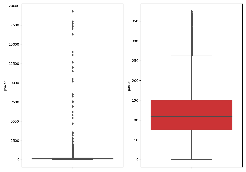
特征构造
1 | # 训练集和测试集放在一起,方便构造特征 |
150721 | # 从邮编中提取城市信息, 相当于加入了先验知识 |
数据分桶
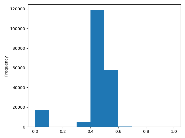
1 | # 数据分桶 以 power 为例 |
power_bin power
0 5.0 60
1 NaN 0
2 16.0 163
3 19.0 193
4 6.0 681 | # 删除不需要的数据 |
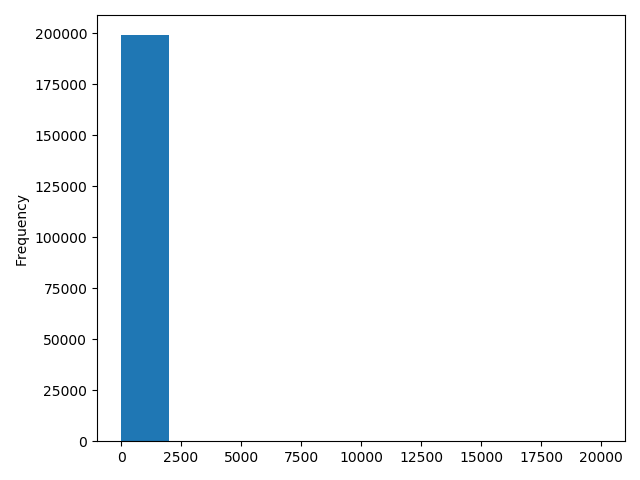
(199037, 39)1 | print(data.columns) |
Index(['SaleID', 'name', 'model', 'brand', 'bodyType', 'fuelType', 'gearbox',
'power', 'kilometer', 'notRepairedDamage', 'seller', 'offerType',
'price', 'v_0', 'v_1', 'v_2', 'v_3', 'v_4', 'v_5', 'v_6', 'v_7', 'v_8',
'v_9', 'v_10', 'v_11', 'v_12', 'v_13', 'v_14', 'train', 'used_time',
'city', 'brand_amount', 'brand_price_max', 'brand_price_median',
'brand_price_min', 'brand_price_sum', 'brand_price_std',
'brand_price_average', 'power_bin'],
dtype='object')导出数据
1 | # 目前的数据其实已经可以给树模型使用了, 所以我们导出一下 |
特征构造
1 | # 我们可以再构造一份特征给 LR NN 之类的模型用 |
1 | # 我们刚刚已经对 train 进行异常值处理了,但是现在还有这么奇怪的分布是因为 test 中的 power 异常值, |
归一化
1 | # 我们对其取 log, 再做归一化 |
1 | # km 的比较正常, 应该已经做过分桶了 |

1 | # 所以可以直接作归一化 |
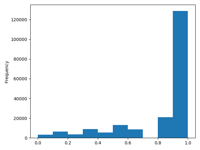
1 | # 除此之外 还有我们刚刚构造的统计量特征: |
(199037, 370)1 | print(data.columns) |
Index(['SaleID', 'name', 'power', 'kilometer', 'seller', 'offerType', 'price',
'v_0', 'v_1', 'v_2',
...
'power_bin_20.0', 'power_bin_21.0', 'power_bin_22.0', 'power_bin_23.0',
'power_bin_24.0', 'power_bin_25.0', 'power_bin_26.0', 'power_bin_27.0',
'power_bin_28.0', 'power_bin_29.0'],
dtype='object', length=370)导出数据
1 | # 这份数据可以给 LR 用 |
特征筛选
过滤式
1 | # 1)过滤式 |
0.5728285196051496
-0.4082569701616764
0.058156610025581514
0.3834909576057687
0.259066833880992
0.386910423934094471 | # 当然也可以直接看图 |
包裹式
- 下面的代码运行错误,看不懂
1
2
3
4
5
6
7
8
9
10
11
12
13
14
15
16
17
18
19
20
21
22# # 2)包裹式
from mlxtend.feature_selection import SequentialFeatureSelector as SFS #序列特征算法的实现——贪婪搜索算法
from sklearn.linear_model import LinearRegression # 基于最小二乘法的线性回归
sfs = SFS(LinearRegression(), # 分类器或回归矩阵
k_features=10, # 要选择的特征数量
forward=True, # 如果为True,则向前选择,否则为反向选择
floating=False, # 如果为True,则添加条件排除/包含。
scoring="r2", # 对于sklearn回归变量使用“ r2”
cv=0) # 如果cv为None、False或0,则不进行交叉验证
x = data.drop(["price"], axis=1)
x = x.fillna(0)
y = data["price"]
sfs.fit(x, y) # 执行特征选择并从训练数据中学习模型 x训练样本 y目标值
sfs.k_feature_names_
# 画出来,可以看到边际效益
from mlxtend.plotting import plot_sequential_feature_selection as plot_sfs
import matplotlib.pyplot as plt
fig1 = plot_sfs(sfs.get_metric_dict(), kind='std_dev')
plt.grid()
嵌入式
1 | # 下一章介绍,Lasso 回归和决策树可以完成嵌入式特征选择 |
代码片段
1 | import pandas as pd |
经验总结
特征工程是比赛中最至关重要的的一块,特别的传统的比赛,大家的模型可能都差不多,调参带来的效果增幅是非常有限的,但特征工程的好坏往往会决定了最终的排名和成绩。
特征工程的主要目的还是在于将数据转换为能更好地表示潜在问题的特征,从而提高机器学习的性能。比如,异常值处理是为了去除噪声,填补缺失值可以加入先验知识等。
特征构造也属于特征工程的一部分,其目的是为了增强数据的表达。
有些比赛的特征是匿名特征,这导致我们并不清楚特征相互直接的关联性,这时我们就只有单纯基于特征进行处理,比如装箱,groupby,agg 等这样一些操作进行一些特征统计,此外还可以对特征进行进一步的 log,exp 等变换,或者对多个特征进行四则运算(如上面我们算出的使用时长),多项式组合等然后进行筛选。由于特性的匿名性其实限制了很多对于特征的处理,当然有些时候用 NN 去提取一些特征也会达到意想不到的良好效果。
对于知道特征含义(非匿名)的特征工程,特别是在工业类型比赛中,会基于信号处理,频域提取,峰度,偏度等构建更为有实际意义的特征,这就是结合背景的特征构建,在推荐系统中也是这样的,各种类型点击率统计,各时段统计,加用户属性的统计等等,这样一种特征构建往往要深入分析背后的业务逻辑或者说物理原理,从而才能更好的找到 magic。
当然特征工程其实是和模型结合在一起的,这就是为什么要为 LR NN 做分桶和特征归一化的原因,而对于特征的处理效果和特征重要性等往往要通过模型来验证。
总的来说,特征工程是一个入门简单,但想精通非常难的一件事。
Datawhale零基础入门数据挖掘-Task2
- EDA的价值主要在于熟悉数据集,了解数据集,对数据集进行验证来确定所获得数据集可以用于接下来的机器学习或者深度学习使用
- 当了解了数据集之后我们下一步就是要去了解变量间的相互关系以及变量与预测值之间的存在关系
- 进行数据处理以及特征工程,使数据集的结构和特征集让接下来的预测问题更加可靠
载入各种数据科学以及可视化库
载入各种数据科学以及可视化库
1 | # 导入warnings包,利用过滤器来实现忽略警告语句 |
载入数据
1 | ## pd.set_option('display.max_columns', None)# 显示所有列 |
- 以下主要以Train_data为例
简略观察数据
1
2## 2)简略观察数据(head()+shape)
print(Train_data.head().append(Train_data.tail()))
| SaleID | name | regDate | model | … | v_11 | v_12 | v_13 | v_14 | |
|---|---|---|---|---|---|---|---|---|---|
| 0 | 0 | 736 | 20040402 | 30.0 | … | 2.804097 | -2.420821 | 0.795292 | 0.914762 |
| 1 | 1 | 2262 | 20030301 | 40.0 | … | 2.096338 | -1.030483 | -1.722674 | 0.245522 |
| 2 | 2 | 14874 | 20040403 | 115.0 | … | 1.803559 | 1.565330 | -0.832687 | -0.229963 |
| 3 | 3 | 71865 | 19960908 | 109.0 | … | 1.285940 | -0.501868 | -2.438353 | -0.478699 |
| 4 | 4 | 111080 | 20120103 | 110.0 | … | 0.910783 | 0.931110 | 2.834518 | 1.923482 |
| 149995 | 149995 | 163978 | 20000607 | 121.0 | … | -2.983973 | 0.589167 | -1.304370 | -0.302592 |
| 149996 | 149996 | 184535 | 20091102 | 116.0 | … | -2.774615 | 2.553994 | 0.924196 | -0.272160 |
| 149997 | 149997 | 147587 | 20101003 | 60.0 | … | -1.630677 | 2.290197 | 1.891922 | 0.414931 |
| 149998 | 149998 | 45907 | 20060312 | 34.0 | … | -2.633719 | 1.414937 | 0.431981 | -1.659014 |
| 149999 | 149999 | 177672 | 19990204 | 19.0 | … | -3.179913 | 0.031724 | -1.483350 | -0.342674 |
[10 rows x 31 columns]
1 | print(Train_data.shape) |
(150000, 31)总览数据概况
- describe种有每列的统计量,个数count、平均值mean、方差std、最小值min、中位数25% 50% 75% 、以及最大值 看这个信息主要是瞬间掌握数据的大概的范围以及每个值的异常值的判断,比如有的时候会发现999 9999 -1 等值这些其实都是nan的另外一种表达方式,有的时候需要注意下
- info 通过info来了解数据每列的type,有助于了解是否存在除了nan以外的特殊符号异常
通过describe()来熟悉相关统计量
1 | ## 3)通过describe()来熟悉相关统计量 |
| SaleID | name | … | v_13 | v_14 | |
|---|---|---|---|---|---|
| count | 150000.000000 | 150000.000000 | … | 150000.000000 | 150000.000000 |
| mean | 74999.500000 | 68349.172873 | … | 0.000313 | -0.000688 |
| std | 43301.414527 | 61103.875095 | … | 1.288988 | 1.038685 |
| min | 0.000000 | 0.000000 | … | -4.153899 | -6.546556 |
| 25% | 37499.750000 | 11156.000000 | … | -1.057789 | -0.437034 |
| 50% | 74999.500000 | 51638.000000 | … | -0.036245 | 0.141246 |
| 75% | 112499.250000 | 118841.250000 | … | 0.942813 | 0.680378 |
| max | 149999.000000 | 196812.000000 | … | 11.147669 | 8.658418 |
[8 rows x 30 columns]
通过info()来熟悉数据类型
1 | ## 4)通过info()来熟悉数据类型 |
<class 'pandas.core.frame.DataFrame'>
RangeIndex: 150000 entries, 0 to 149999
Data columns (total 31 columns):
 #   Column             Non-Null Count   Dtype
---  ------             --------------   -----
 0   SaleID             150000 non-null  int64
 1   name               150000 non-null  int64
 2   regDate            150000 non-null  int64
 3   model              149999 non-null  float64
 4   brand              150000 non-null  int64
 5   bodyType           145494 non-null  float64
 6   fuelType           141320 non-null  float64
 7   gearbox            144019 non-null  float64
 8   power              150000 non-null  int64
 9   kilometer          150000 non-null  float64
 10  notRepairedDamage  150000 non-null  object
 11  regionCode         150000 non-null  int64
 12  seller             150000 non-null  int64
 13  offerType          150000 non-null  int64
 14  creatDate          150000 non-null  int64
 15  price              150000 non-null  int64
 16  v_0                150000 non-null  float64
 17  v_1                150000 non-null  float64
 18  v_2                150000 non-null  float64
 19  v_3                150000 non-null  float64
 20  v_4                150000 non-null  float64
 21  v_5                150000 non-null  float64
 22  v_6                150000 non-null  float64
 23  v_7                150000 non-null  float64
 24  v_8                150000 non-null  float64
 25  v_9                150000 non-null  float64
 26  v_10               150000 non-null  float64
 27  v_11               150000 non-null  float64
 28  v_12               150000 non-null  float64
 29  v_13               150000 non-null  float64
 30  v_14               150000 non-null  float64
dtypes: float64(20), int64(10), object(1)
memory usage: 35.5+ MB
None
判断数据缺失和异常
查看每列的存在nan情况
1 | ## 5) 查看每列的存在nan情况 |
SaleID 0
name 0
regDate 0
model 1
brand 0
bodyType 4506
fuelType 8680
gearbox 5981
power 0
kilometer 0
notRepairedDamage 0
regionCode 0
seller 0
offerType 0
creatDate 0
price 0
v_0 0
v_1 0
v_2 0
v_3 0
v_4 0
v_5 0
v_6 0
v_7 0
v_8 0
v_9 0
v_10 0
v_11 0
v_12 0
v_13 0
v_14 0
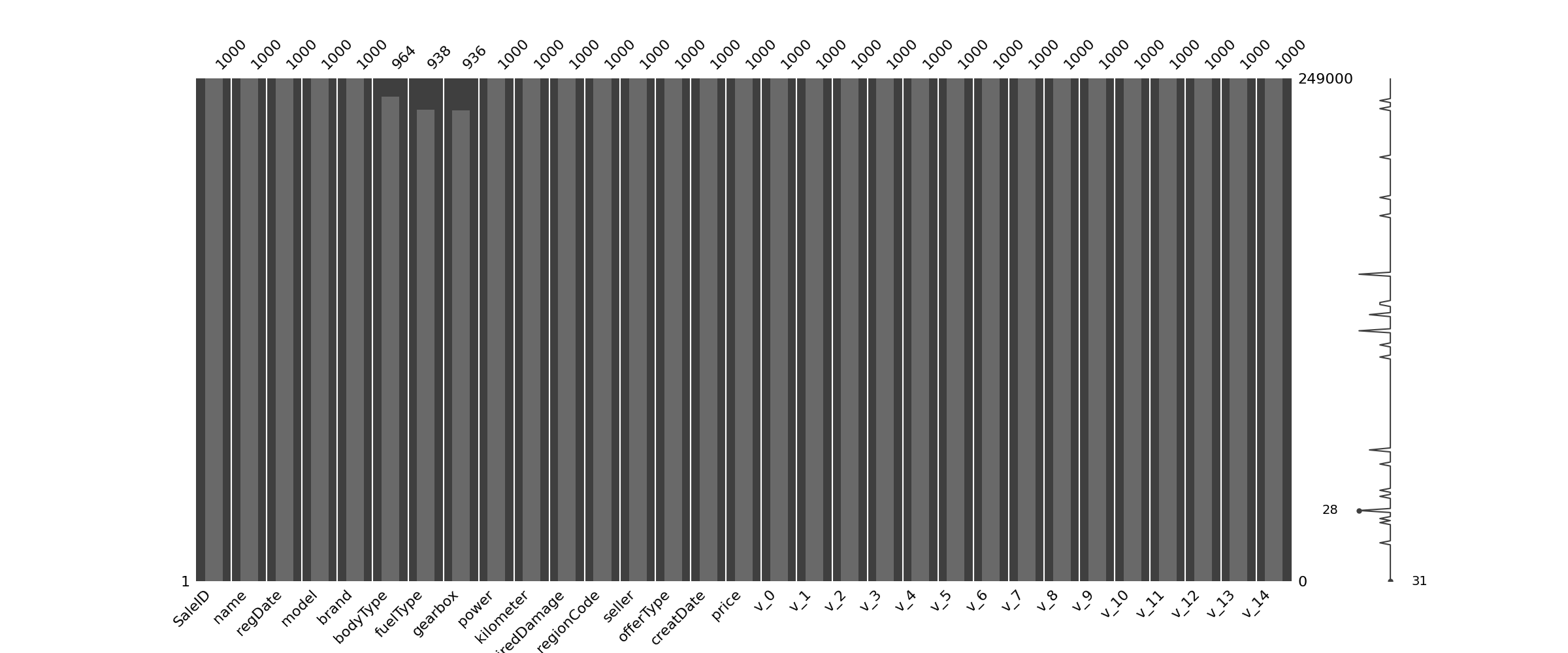
dtype: int64nan可视化
1 | #nan可视化 |
- 通过以上可以很直观的了解哪些列存在 “nan”, 并可以把nan的个数打印,主要的目的在于 nan存在的个数是否真的很大,如果很小一般选择填充,如果使用lgb等树模型可以直接空缺,让树自己去优化,但如果nan存在的过多、可以考虑删掉
可视化看下缺省值
1 | ## 可视化看下缺省值 |
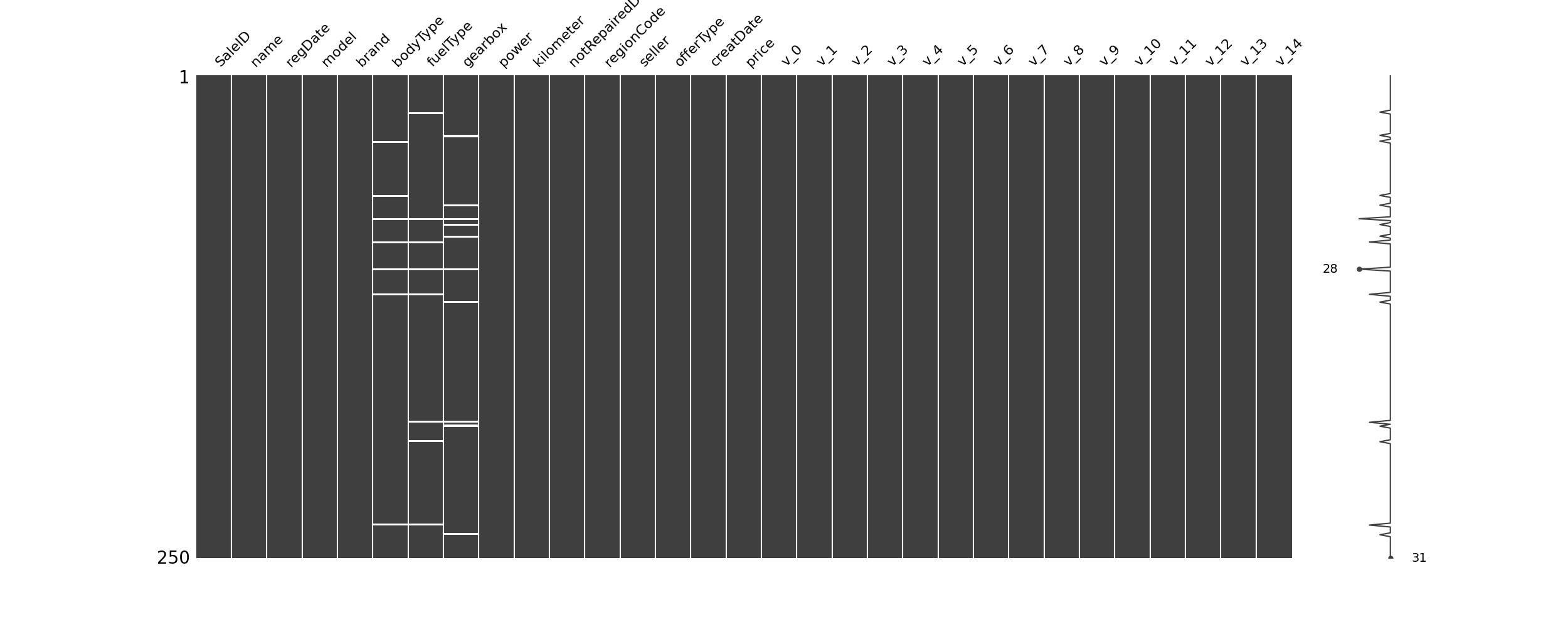
1 | msno.bar(Train_data.sample(1000)) # 条形图 |
查看异常值检测
通过前面info()来熟悉数据类型,可以发现除了notRepairedDamage 为object类型其他都为数字 这里我们把他的几个不同的值都进行显示就知道了
1
print(Train_data["notRepairedDamage"].value_counts()) # 返回包含值和count
0.0 111361
-24324
1.0 14315
Name: notRepairedDamage, dtype: int64可以看出来‘ - ’也为空缺值,因为很多模型对nan有直接的处理,这里我们先不做处理,先替换成nan
1 | Train_data["notRepairedDamage"].replace("-", np.nan, inplace=True) # 将数据中‘-’替换成nan值 |
0.0    111361
1.0     14315
Name: notRepairedDamage, dtype: int64- 再查看nan值情况
1 | print(Train_data.isnull().sum()) |
SaleID                   0
name                     0
regDate                  0
model                    1
brand                    0
bodyType              4506
fuelType              8680
gearbox               5981
power                    0
kilometer                0
notRepairedDamage    24324
regionCode               0
seller                   0
offerType                0
creatDate                0
price                    0
v_0                      0
v_1                      0
v_2                      0
v_3                      0
v_4                      0
v_5                      0
v_6                      0
v_7                      0
v_8                      0
v_9                      0
v_10                     0
v_11                     0
v_12                     0
v_13                     0
v_14                     0
dtype: int64- 以下两个类别特征严重倾斜,一般不会对预测有什么帮助,故这边先删掉,当然你也可以继续挖掘,但是一般意义不大
1 | print(Train_data["seller"].value_counts()) |
0    149999
1         1
Name: seller, dtype: int64
1 | print(Train_data["offerType"].value_counts()) |
0    150000
Name: offerType, dtype: int64
1 | # 删除严重倾斜的数据 |
<class 'pandas.core.frame.DataFrame'>
RangeIndex: 150000 entries, 0 to 149999
Data columns (total 29 columns):
 #   Column             Non-Null Count   Dtype
---  ------             --------------   -----
 0   SaleID             150000 non-null  int64
 1   name               150000 non-null  int64
 2   regDate            150000 non-null  int64
 3   model              149999 non-null  float64
 4   brand              150000 non-null  int64
 5   bodyType           145494 non-null  float64
 6   fuelType           141320 non-null  float64
 7   gearbox            144019 non-null  float64
 8   power              150000 non-null  int64
 9   kilometer          150000 non-null  float64
 10  notRepairedDamage  150000 non-null  object
 11  regionCode         150000 non-null  int64
 12  creatDate          150000 non-null  int64
 13  price              150000 non-null  int64
 14  v_0                150000 non-null  float64
 15  v_1                150000 non-null  float64
 16  v_2                150000 non-null  float64
 17  v_3                150000 non-null  float64
 18  v_4                150000 non-null  float64
 19  v_5                150000 non-null  float64
 20  v_6                150000 non-null  float64
 21  v_7                150000 non-null  float64
 22  v_8                150000 non-null  float64
 23  v_9                150000 non-null  float64
 24  v_10               150000 non-null  float64
 25  v_11               150000 non-null  float64
 26  v_12               150000 non-null  float64
 27  v_13               150000 non-null  float64
 28  v_14               150000 non-null  float64
dtypes: float64(20), int64(8), object(1)
memory usage: 33.2+ MB
None

(150000, 29)
了解预测值的分布
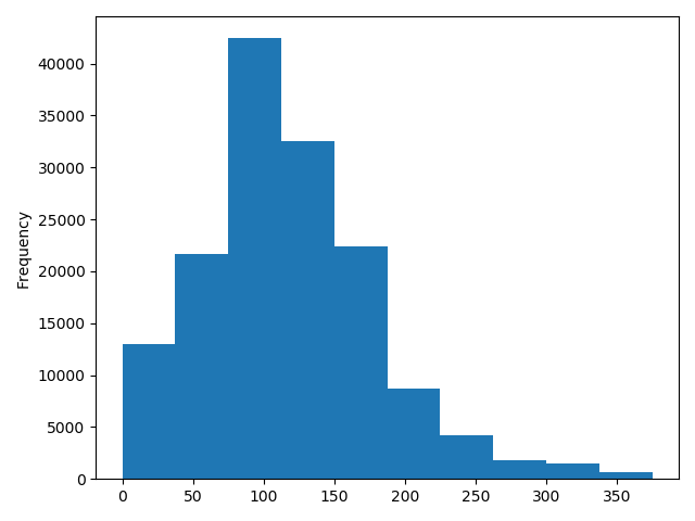
1 | print(Train_data["price"]) |
0         1850
1         3600
2         6222
3         2400
4         5200
      ...
149995    5900
149996    9500
149997    7500
149998    4999
149999    4700
Name: price, Length: 150000, dtype: int64

500      2337
1500     2158
1200     1922
1000     1850
2500     1821
     ...
25321       1
8886        1
8801        1
37920       1
8188        1
Name: price, Length: 3763, dtype: int64
总体分布情况(无界约翰逊分布等)
1 | ## 1)总体分布情况(无界约翰逊分布等) |
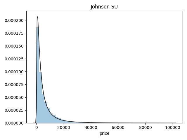
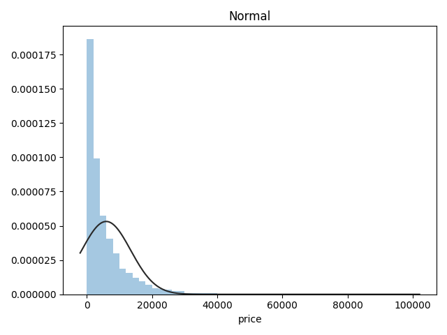
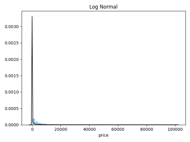
- 价格不服从正态分布,所以在进行回归之前,它必须进行转换。虽然对数变换做得很好,但最佳拟合是无界约翰逊分布
查看skewness and kurtosis
1 | ## 2)查看skewness and kurtosis |
Skewness: 3.346487
Kurtosis: 18.995183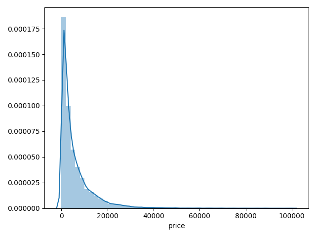
1 | print(Train_data.skew()) |
SaleID 6.017846e-17
name 5.576058e-01
regDate 2.849508e-02
model 1.484388e+00
brand 1.150760e+00
bodyType 9.915299e-01
fuelType 1.595486e+00
gearbox 1.317514e+00
power 6.586318e+01
kilometer -1.525921e+00
notRepairedDamage 2.430640e+00
regionCode 6.888812e-01
creatDate -7.901331e+01
price 3.346487e+00
v_0 -1.316712e+00
v_1 3.594543e-01
v_2 4.842556e+00
v_3 1.062920e-01
v_4 3.679890e-01
v_5 -4.737094e+00
v_6 3.680730e-01
v_7 5.130233e+00
v_8 2.046133e-01
v_9 4.195007e-01
v_10 2.522046e-02
v_11 3.029146e+00
v_12 3.653576e-01
v_13 2.679152e-01
v_14 -1.186355e+00
dtype: float64
SaleID -1.200000
name -1.039945
regDate -0.697308
model 1.740483
brand 1.076201
bodyType 0.206937
fuelType 5.880049
gearbox -0.264161
power 5733.451054
kilometer 1.141934
notRepairedDamage 3.908072
regionCode -0.340832
creatDate 6881.080328
price 18.995183
v_0 3.993841
v_1 -1.753017
v_2 23.860591
v_3 -0.418006
v_4 -0.197295
v_5 22.934081
v_6 -1.742567
v_7 25.845489
v_8 -0.636225
v_9 -0.321491
v_10 -0.577935
v_11 12.568731
v_12 0.268937
v_13 -0.438274
v_14 2.393526
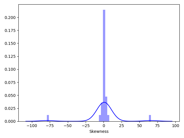
dtype: float641 | sns.distplot(Train_data.skew(), color="blue", axlabel="Skewness") |
1 | sns.distplot(Train_data.kurt(), color="orange", axlabel="Kurtness") |
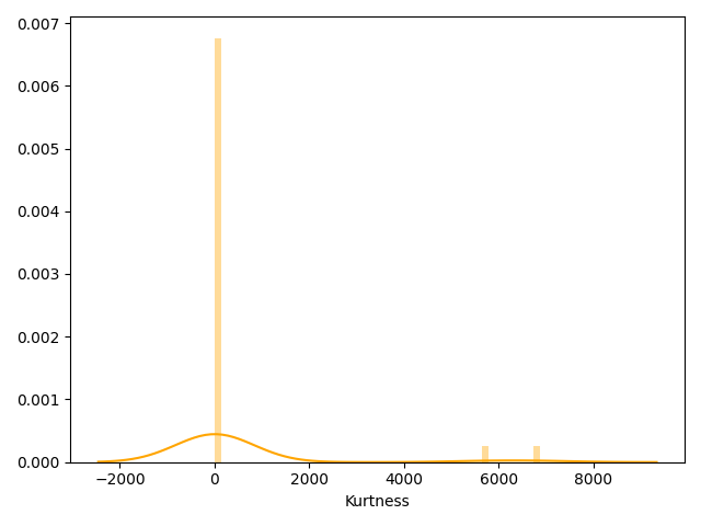
- skew、kurt说明参考https://www.cnblogs.com/wyy1480/p/10474046.html
查看预测值的具体频数
1 | # 3)查看预测值的具体频数 |
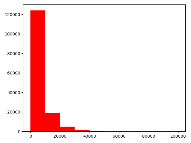
- 查看频数, 大于20000得值极少,其实这里也可以把这些当作特殊得值(异常值)直接用填充或者删掉,在前面进行
1 | # log变换之后的分布比较均匀,可以进行log变换进行预测,这也是预测问题常用的trick |
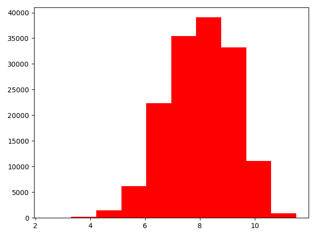
- log变换之后的分布较均匀,可以进行log变换进行预测,这也是预测问题常用的trick
特征分为类别特征和数字特征,并对类别特征查看nunique分布
数据类型
- name - 汽车编码
- regDate - 汽车注册时间
- model - 车型编码
- brand - 品牌
- bodyType - 车身类型
- fuelType - 燃油类型
- gearbox - 变速箱
- power - 汽车功率
- kilometer - 汽车行驶公里
- notRepairedDamage - 汽车有尚未修复的损坏
- regionCode - 看车地区编码
- seller - 销售方 【以删】
- offerType - 报价类型 【以删】
- creatDate - 广告发布时间
- price - 汽车价格
- v_0’, ‘v_1’, ‘v_2’, ‘v_3’, ‘v_4’, ‘v_5’, ‘v_6’, ‘v_7’, ‘v_8’, ‘v_9’, ‘v_10’, ‘v_11’, ‘v_12’, ‘v_13’,’v_14’【匿名特征,包含v0-14在内15个匿名特征】
1 | # 分离label即预测值 |
1 | # 这个区别方式适用于没有直接label coding的数据 |
1 | # 数字特征 |
1 | ## 类别特征nunique分布——Train_data |
name的特征分布如下:
name特征有99662个不同的值
708       282
387       282
55        280
1541      263
203       233
     ...
5074        1
7123        1
11221       1
13270       1
174485      1
Name: name, Length: 99662, dtype: int64

model的特征分布如下:
model特征有248个不同的值
0.0      11762
19.0      9573
4.0       8445
1.0       6038
29.0      5186
     ...
245.0        2
209.0        2
240.0        2
242.0        2
247.0        1
Name: model, Length: 248, dtype: int64

brand的特征分布如下:
brand特征有40个不同的值
0     31480
4     16737
14    16089
10    14249
1     13794
6     10217
9      7306
5      4665
13     3817
11     2945
3      2461
7      2361
16     2223
8      2077
25     2064
27     2053
21     1547
15     1458
19     1388
20     1236
12     1109
22     1085
26      966
30      940
17      913
24      772
28      649
32      592
29      406
37      333
2       321
31      318
18      316
36      228
34      227
33      218
23      186
35      180
38       65
39        9
Name: brand, dtype: int64

bodyType的特征分布如下:
bodyType特征有8个不同的值
0.0    41420
1.0    35272
2.0    30324
3.0    13491
4.0     9609
5.0     7607
6.0     6482
7.0     1289
Name: bodyType, dtype: int64

fuelType的特征分布如下:
fuelType特征有7个不同的值
0.0    91656
1.0    46991
2.0     2212
3.0      262
4.0      118
5.0       45
6.0       36
Name: fuelType, dtype: int64

gearbox的特征分布如下:
gearbox特征有2个不同的值
0.0    111623
1.0     32396
Name: gearbox, dtype: int64

notRepairedDamage的特征分布如下:
notRepairedDamage特征有2个不同的值
0.0    111361
1.0     14315
Name: notRepairedDamage, dtype: int64

regionCode的特征分布如下:
regionCode特征有7905个不同的值
419     369
764     258
125     137
176     136
462     134
       ...
6414      1
7063      1
4239      1
5931      1
7267      1
Name: regionCode, Length: 7905, dtype: int64
数字特征分析
1 | numeric_features.append("price") |
['power',
'kilometer',
'v_0',
'v_1',
'v_2',
'v_3',
'v_4',
'v_5',
'v_6',
'v_7',
'v_8',
'v_9',
'v_10',
'v_11',
'v_12',
'v_13',
'v_14',
'price']
1 | print(Train_data.head()) |
| SaleID | name | regDate | model | … | v_11 | v_12 | v_13 | v_14 | |
|---|---|---|---|---|---|---|---|---|---|
| 0 | 0 | 736 | 20040402 | 30.0 | … | 2.804097 | -2.420821 | 0.795292 | 0.914762 |
| 1 | 1 | 2262 | 20030301 | 40.0 | … | 2.096338 | -1.030483 | -1.722674 | 0.245522 |
| 2 | 2 | 14874 | 20040403 | 115.0 | … | 1.803559 | 1.565330 | -0.832687 | -0.229963 |
| 3 | 3 | 71865 | 19960908 | 109.0 | … | 1.285940 | -0.501868 | -2.438353 | -0.478699 |
| 4 | 4 | 111080 | 20120103 | 110.0 | … | 0.910783 | 0.931110 | 2.834518 | 1.923482 |
[5 rows x 29 columns]
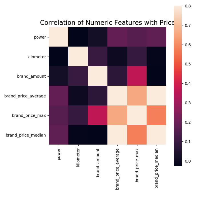
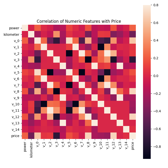
相关性分析
1 | ## 1)相关性分析 |
price        1.000000
v_12         0.692823
v_8          0.685798
v_0          0.628397
power        0.219834
v_5          0.164317
v_2          0.085322
v_6          0.068970
v_1          0.060914
v_14         0.035911
v_13        -0.013993
v_7         -0.053024
v_4         -0.147085
v_9         -0.206205
v_10        -0.246175
v_11        -0.275320
kilometer   -0.440519
v_3         -0.730946
Name: price, dtype: float64
1 | f , ax = plt.subplots(figsize = (7, 7)) |
查看几个特征的偏度和峰度
1 | ## 2)查看几个特征的偏度和峰度 |
power           Skewness:65.86     Kurtosis:5733.45
kilometer       Skewness:-1.53     Kurtosis:001.14
v_0             Skewness:-1.32     Kurtosis:003.99
v_1             Skewness:00.36     Kurtosis:-01.75
v_2             Skewness:04.84     Kurtosis:023.86
v_3             Skewness:00.11     Kurtosis:-00.42
v_4             Skewness:00.37     Kurtosis:-00.20
v_5             Skewness:-4.74     Kurtosis:022.93
v_6             Skewness:00.37     Kurtosis:-01.74
v_7             Skewness:05.13     Kurtosis:025.85
v_8             Skewness:00.20     Kurtosis:-00.64
v_9             Skewness:00.42     Kurtosis:-00.32
v_10            Skewness:00.03     Kurtosis:-00.58
v_11            Skewness:03.03     Kurtosis:012.57
v_12            Skewness:00.37     Kurtosis:000.27
v_13            Skewness:00.27     Kurtosis:-00.44
v_14            Skewness:-1.19     Kurtosis:002.39
price           Skewness:03.35     Kurtosis:019.00
每个数字特征得分布可视化
1 | ## 3)每个数字特征得分布可视化 |
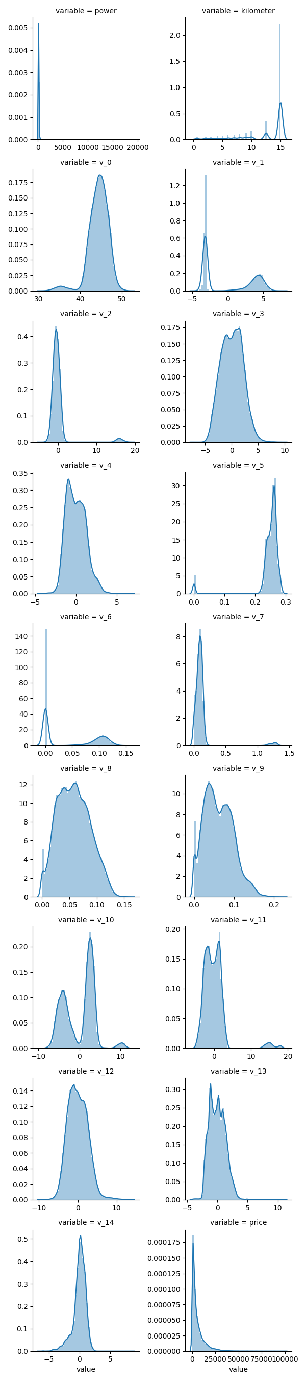
- 可以看出匿名特征相对分布均匀
数字特征相互之间的关系可视化
1 | ## 4)数字特征相互之间的关系可视化 |
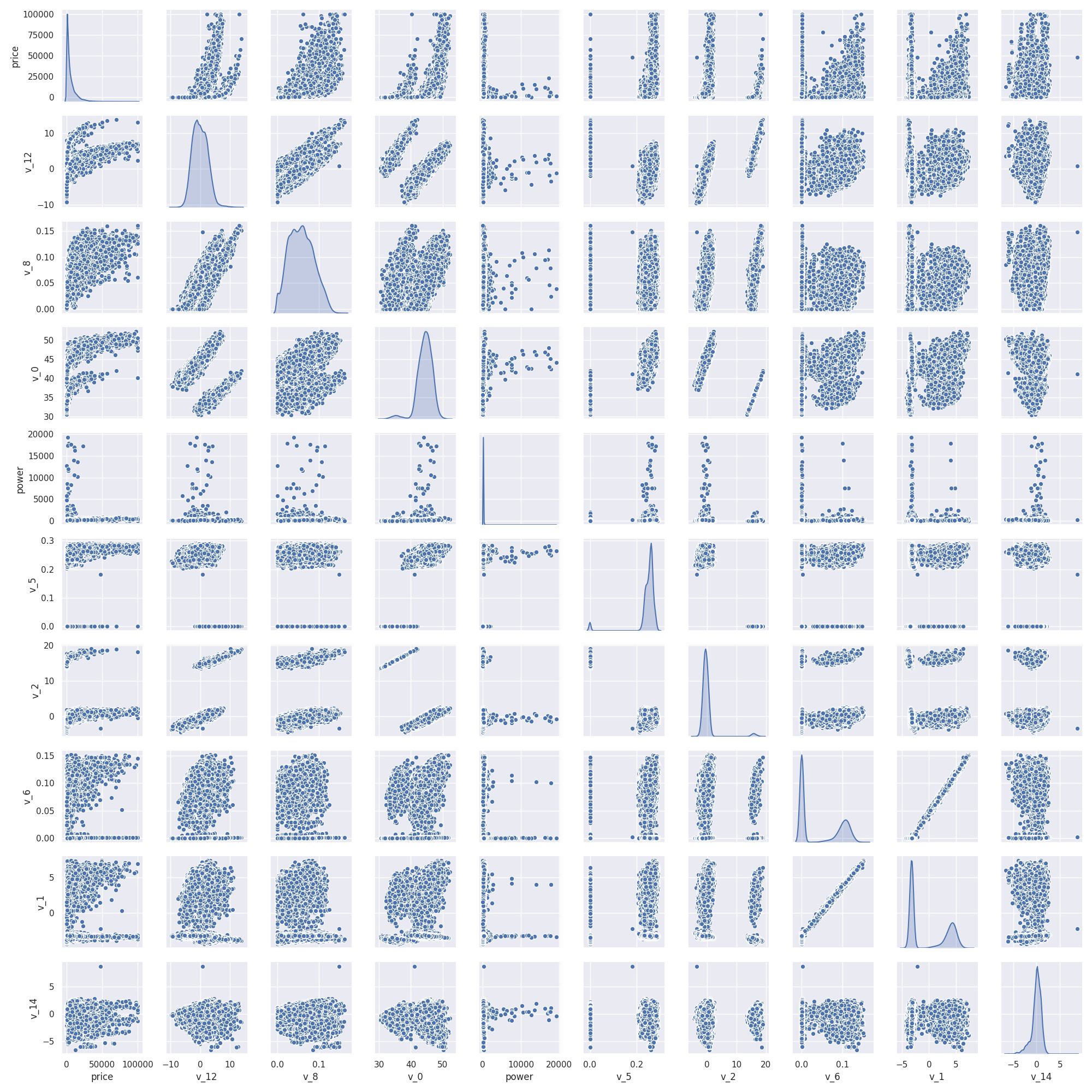
多变量互相回归关系可视化
此处是多变量之间的关系可视化,可视化更多学习可参考很不错的文章https://www.jianshu.com/p/6e18d21a4cad
1
print(Train_data.columns)
Index([‘SaleID’, ‘name’, ‘regDate’, ‘model’, ‘brand’, ‘bodyType’, ‘fuelType’,
 'gearbox', 'power', 'kilometer', 'notRepairedDamage', 'regionCode',
 'creatDate', 'price', 'v_0', 'v_1', 'v_2', 'v_3', 'v_4', 'v_5', 'v_6',
 'v_7', 'v_8', 'v_9', 'v_10', 'v_11', 'v_12', 'v_13', 'v_14'],
dtype='object')
1 | print(Y_train) |
0         1850
1         3600
2         6222
3         2400
4         5200
      ...
149995    5900
149996    9500
149997    7500
149998    4999
149999    4700
Name: price, Length: 150000, dtype: int64
1 | ## 5)多变量互相关系回归关系可视化 |
类别特征分析
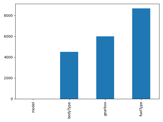
nunique分布
1 | ## 1)nunique分布 |
99662
248
40
8
7
2
2
79051 | print(categorical_features) |
['name',
'model',
'brand',
'bodyType',
'fuelType',
'gearbox',
'notRepairedDamage',
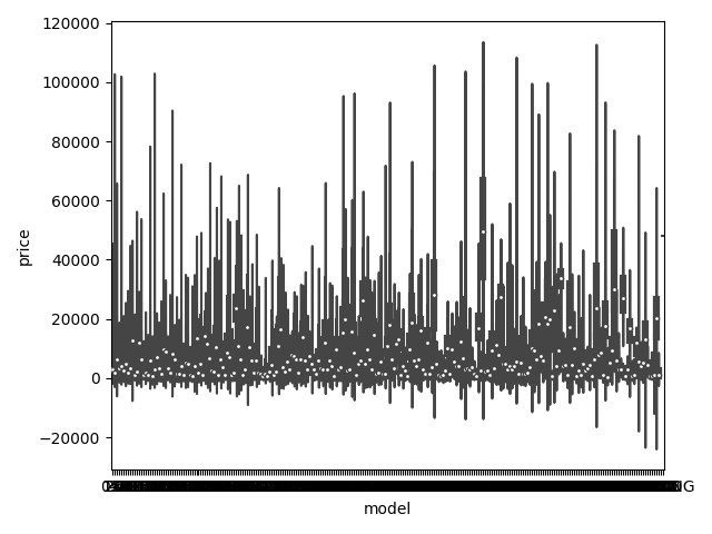
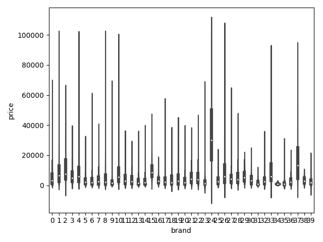
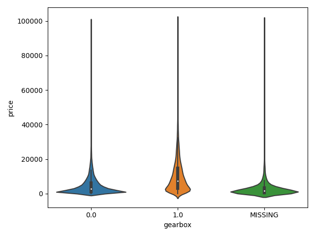
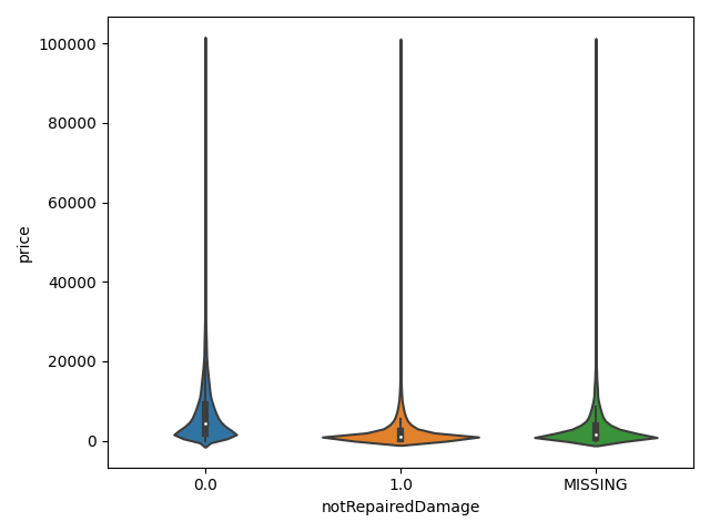
'regionCode']类别特征箱形图可视化
1 | ## 2)类别箱形图可视化 |

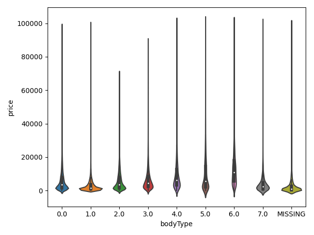
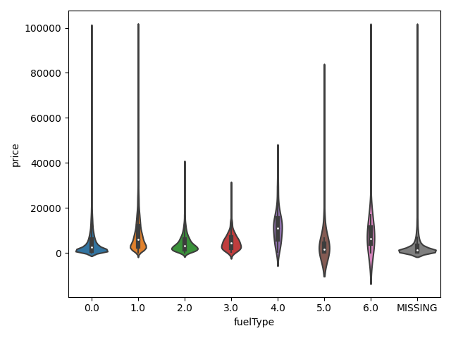
类别特征的小提琴图可视化
1 | print(Train_data.columns) |
Index(['SaleID', 'name', 'regDate', 'model', 'brand', 'bodyType', 'fuelType',
'gearbox', 'power', 'kilometer', 'notRepairedDamage', 'regionCode',
'creatDate', 'price', 'v_0', 'v_1', 'v_2', 'v_3', 'v_4', 'v_5', 'v_6',
'v_7', 'v_8', 'v_9', 'v_10', 'v_11', 'v_12', 'v_13', 'v_14'],
dtype='object')1 | ## 3)类别特征的小提琴图可视化 |
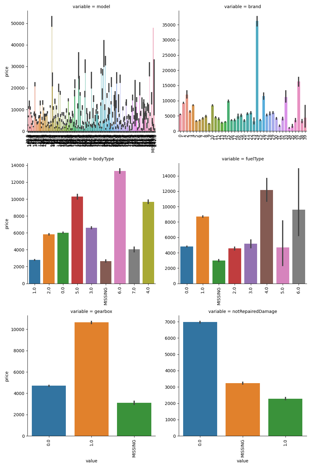
类别特征的柱形图可视化
1 | print(categorical_features) |
['model',
'brand',
'bodyType',
'fuelType',
'gearbox',
'notRepairedDamage']1 | ## 4)类别特征的柱形图可视化 |
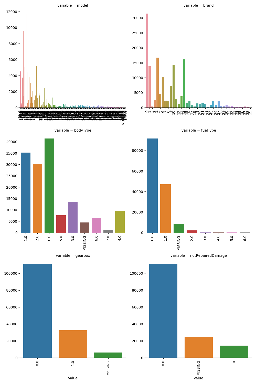
类别特征的每个类别频数可视化
1 | ## 5)类别特征的每个类别频数可视化 |
用pandas_profiling生成数据报告
1 | ## 生成数据报告 |
代码片段
1 | # 导入warnings包,利用过滤器来实现忽略警告语句 |
经验总结
所给出的EDA步骤为广为普遍的步骤,在实际的不管是工程还是比赛过程中,这只是最开始的一步,也是最基本的一步。
接下来一般要结合模型的效果以及特征工程等来分析数据的实际建模情况,根据自己的一些理解,查阅文献,对实际问题做出判断和深入的理解。
最后不断进行EDA与数据处理和挖掘,来到达更好的数据结构和分布以及较为强势相关的特征
数据探索在机器学习中我们一般称为EDA(Exploratory Data Analysis):
是指对已有的数据(特别是调查或观察得来的原始数据)在尽量少的先验假定下进行探索,通过作图、制表、方程拟合、计算特征量等手段探索数据的结构和规律的一种数据分析方>法。
数据探索有利于我们发现数据的一些特性,数据之间的关联性,对于后续的特征构建是很有帮助的。
对于数据的初步分析(直接查看数据,或.sum(), .mean(),.descirbe()等统计函数)可以从:样本数量,训练集数量,是否有时间特征,是否是时许问题,特征所表示的含义(非匿名特征),特征类型(字符类似,int,float,time),特征的缺失情况(注意缺失的在数据中的表现形式,有些是空的有些是”NAN”符号等),特征的均值方差情况。
分析记录某些特征值缺失占比30%以上样本的缺失处理,有助于后续的模型验证和调节,分析特征应该是填充(填充方式是什么,均值填充,0填充,众数填充等),还是舍去,还是先做样本分类用不同的特征模型去预测。
对于异常值做专门的分析,分析特征异常的label是否为异常值(或者偏离均值较远或者是特殊符号),异常值是否应该剔除,还是用正常值填充,是记录异常,还是机器本身异常等。
对于Label做专门的分析,分析标签的分布情况等。
进步分析可以通过对特征作图,特征和label联合做图(统计图,离散图),直观了解特征的分布情况,通过这一步也可以发现数据之中的一些异常值等,通过箱型图分析一些特征值的偏离情况,对于特征和特征联合作图,对于特征和label联合作图,分析其中的一些关联性。
Datawhale零基础入门数据挖掘-Task1
学习背景:由Datawhale与天池开放的零基础入门数据挖掘赛事-二手车交易价格预测
赛题概括:赛题以预测二手车的交易价格为任务,数据集报名后可见并可下载,该数据来自某交易平台的二手车交易记录,总数据量超过40w,包含31列变量信息,其中15列为匿名变量。为了保证比赛的公平性,将会从中抽取15万条作为训练集,5万条作为测试集A,5万条作为测试集B,同时会对name、model、brand和regionCode等信息进行脱敏。
赛题分析
数据概括
一般而言,对于数据在比赛界面都有对应的数据概况介绍(匿名特征除外),说明列的性质特征。了解列的性质会有助于我们对于数据的理解和后续分析。 Tip:匿名特征,就是未告知数据列所属的性质的特征列。
train.csv
- SaleID - 销售样本ID
- name - 汽车编码
- regDate - 汽车注册时间
- model - 车型编码
- brand - 品牌
- bodyType - 车身类型
- fuelType - 燃油类型
- gearbox - 变速箱
- power - 汽车功率
- kilometer - 汽车行驶公里
- notRepairedDamage - 汽车有尚未修复的损坏
- regionCode - 看车地区编码
- seller - 销售方
- offerType - 报价类型
- creatDate - 广告发布时间
- price - 汽车价格
- ‘v_0’, ‘v_1’, ‘v_2’, ‘v_3’, ‘v_4’, ‘v_5’, ‘v_6’, ‘v_7’, ‘v_8’, ‘v_9’, ‘v_10’, ‘v_11’, ‘v_12’, ‘v_13’,’v_14’ 【匿名特征,包含v0-14在内15个匿名特征】
评测标准
赛题评价目标为MAE(Mean Absolute Error):
MAE越小,说明模型预测得越准确
预测建模
- 预测建模就是使用历史数据建立一个模型,去给没有答案的新数据做预测的问题
关于预测建模,可以在下面这篇文章中了解更多信息:
Gentle Introduction to Predictive Modeling: https://machinelearningmastery.com/gentle-introduction-to-predictive-modeling/
预测建模可以被描述成一个近似求取从输入变量(X)到输出变量(y)的映射函数的数学问题。这被称为函数逼近问题
建模算法的任务就是在给定的可用时间和资源的限制下,去寻找最佳映射函数。更多关于机器学习中应用逼近函数的内容,请参阅下面这篇文章:
机器学习是如何运行的(how machine learning work,https://machinelearningmastery.com/how-machine-learning-algorithms-work/)
一般而言,我们可以将函数逼近任务划分为分类任务和回归任务
分类预测建模
分类预测建模是逼近一个从输入变量(X)到离散的输出变量(y)之间的映射函数(f)
输出变量经常被称作标签或者类别。映射函数会对一个给定的观察样本预测一个类别标签
例如,一个文本邮件可以被归为两类:「垃圾邮件」,和「非垃圾邮件」
- 分类问题需要把样本分为两类或者多类
- 分类的输入可以是实数也可以有离散变量
- 只有两个类别的分类问题经常被称作两类问题或者二元分类问题
- 具有多于两类的问题经常被称作多分类问题
- 样本属于多个类别的问题被称作多标签分类问题
分类模型经常为输入样本预测得到与每一类别对应的像概率一样的连续值。这些概率可以被解释为样本属于每个类别的似然度或者置信度。预测到的概率可以通过选择概率最高的类别转换成类别标签
例如,某封邮件可能以 0.1 的概率被分为「垃圾邮件」,以 0.9 的概率被分为「非垃圾邮件」。因为非垃圾邮件的标签的概率最大,所以我们可以将概率转换成「非垃圾邮件」的标签
有很多用来衡量分类预测模型的性能的指标,但是分类准确率可能是最常用的一个
例如,如果一个分类预测模型做了 5 个预测,其中有 3 个是正确的,2 个这是错误的,那么这个模型的准确率就是 60%:
accuracy = correct predictions / total predictions * 100
accuracy = 3 / 5 * 100
accuracy = 60%
能够学习分类模型的算法就叫做分类算法
回归预测模型
回归预测建模是逼近一个从输入变量(X)到连续的输出变量(y)的函数映射
连续输出变量是一个实数,例如一个整数或者浮点数。这些变量通常是数量或者尺寸大小等等
例如,一座房子可能被预测到以 xx 美元出售,也许会在 $100,000 t 到$200,000 的范围内
- 回归问题需要预测一个数量
- 回归的输入变量可以是连续的也可以是离散的
- 有多个输入变量的通常被称作多变量回归
- 输入变量是按照时间顺序的回归称为时间序列预测问题
- 因为回归预测问题预测的是一个数量,所以模型的性能可以用预测结果中的错误来评价
有很多评价回归预测模型的方式,但是最常用的一个可能是计算误差值的均方根,即 RMSE
例如,如果回归预测模型做出了两个预测结果,一个是 1.5,对应的期望结果是 1.0;另一个是 3.3 对应的期望结果是 3.0. 那么,这两个回归预测的 RMSE 如下:
RMSE = sqrt(average(error^2))
RMSE = sqrt(((1.0 - 1.5)^2 + (3.0 - 3.3)^2) / 2)
RMSE = sqrt((0.25 + 0.09) / 2)
RMSE = sqrt(0.17)
RMSE = 0.412
使用 RMSE 的好处就是错误评分的单位与预测结果是一样的
一个能够学习回归预测模型的算法称作回归算法
有些算法的名字也有「regression,回归」一词,例如线性回归和 logistics 回归,这种情况有时候会让人迷惑因为线性回归确实是一个回归问题,但是 logistics 回归却是一个分类问题
分类 vs 回归
分类预测建模问题与回归预测建模问题是不一样的
- 分类是预测一个离散标签的任务
- 回归是预测一个连续数量的任务
分类和回归也有一些相同的地方:
- 分类算法可能预测到一个连续的值,但是这些连续值对应的是一个类别的概率的形式
- 回归算法可以预测离散值,但是以整型量的形式预测离散值的
有些算法既可以用来分类,也可以稍作修改就用来做回归问题,例如决策树和人工神经网络。但是一些算法就不行了——或者说是不太容易用于这两种类型的问题,例如线性回归是用来做回归预测建模的,logistics 回归是用来做分类预测建模的
重要的是,我们评价分类模型和预测模型的方式是不一样的,例如:
- 分类预测可以使用准确率来评价,而回归问题则不能
- 回归预测可以使用均方根误差来评价,但是分类问题则不能
分类问题和回归问题之间的转换
在一些情况中是可以将回归问题转换成分类问题的。例如,被预测的数量是可以被转换成离散数值的范围的
例如,在$0 到$100 之间的金额可以被分为两个区间:
- class 0:$0 到$49
- class 1: $50 到$100
这通常被称作离散化,结果中的输出变量是一个分类,分类的标签是有顺序的(称为叙序数)
在一些情况中,分类是可以转换成回归问题的。例如,一个标签可以被转换成一个连续的范围
一些算法早已通过为每一个类别预测一个概率,这个概率反过来又可以被扩展到一个特定的数值范围:
quantity = min + probability * range
与此对应,一个类别值也可以被序数化,并且映射到一个连续的范围中:
- $0 到 $49 是类别 1
- $0 到 $49 是类别 2
如果分类问题中的类别标签没有自然顺序的关系,那么从分类问题到回归问题的转换也许会导致奇怪的结果或者很差的性能,因为模型可能学到一个并不存在于从输入到连续输出之间的映射函数
原文链接https://machinelearningmastery.com/classification-versus-regression-in-machine-learning/
关于评价指标
- 评估指标即是我们对于一个模型效果的数值型量化。(有点类似与对于一个商品评价打分,而这是针对于模型效果和理想效果之间的一个打分)
一般来说分类和回归问题的评价指标有如下一些形式:
分类算法常见的评估指标如下:
- 对于二类分类器/分类算法,评价指标主要有accuracy, Precision,Recall,F-score,Pr曲线,ROC-AUC曲线
- 对于多类分类器/分类算法,评价指标主要有accuracy, 宏平均和微平均,F-score
对于回归预测类常见的评估指标如下:
- 平均绝对误差(Mean Absolute Error,MAE),均方误差(Mean Squared Error,MSE),平均绝对百分误差(Mean Absolute Percentage Error,MAPE),均方根误差(Root Mean Squared Error), R2(R-Square)
平均绝对误差
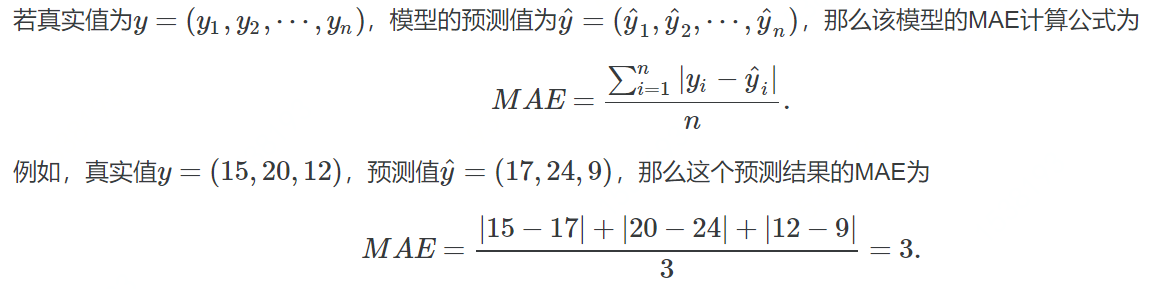
- 平均绝对误差(Mean Absolute Error,MAE):其能更好地反映预测值与真实值误差的实际情况,其计算公式如下:
$$MAE=\frac{1}{N} \sum_{i=1}^{N}\left|y_{i}-\hat{y}_{i}\right|$$
均方误差
- 均方误差(Mean Squared Error,MSE),均方误差,其计算公式为:
$$MSE=\frac{1}{N} \sum_{i}^{N}\left(y_{i}-\hat{y}_{i}\right)^{2}$$
R2(R-Square)
- 残差平方和:
$$SS_{res}=\sum\left(y_{i}-\hat{y}_{i}\right)^{2}$$ - 总平均值:
$$SS_{tot}=\sum\left(y_{i}-\overline{y}_{i}\right)^{2}$$ - 其中$\overline{y}$表示$y$的平均值得到$R^2$的表达式为:
$$R^{2}=1-\frac{SS_{res}}{SS_{tot}}$$
$R^2$用于度量因变量的变异中可由自变量解释部分所占的比例,取值范围是 0~1,$R^2$越接近1,表明回归平方和占总平方和的比例越大,回归线与各观测点越接近,用x的变化来解释y值变化的部分就越多,回归的拟合程度就越好。所以$R^2$也称为拟合优度(Goodness of Fit)的统计量
$y_{i}$表示真实值,
$\hat{y}_{i}$表示预测值,
$\overline{y}_{i}$表示样本均值。得分越高拟合效果越好
几何解释
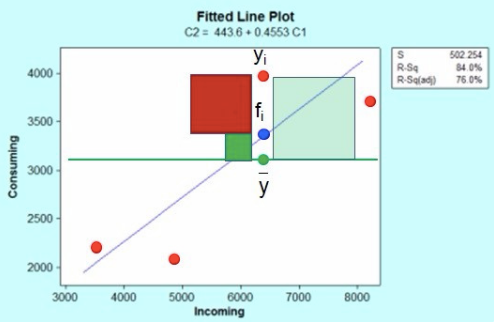
上图红色点是incoming自变量与Consuming因变量对应的散点图,蓝色线是回归方程线(最小二乘法得到);
这里红色点$y_{i}$表示一个响应观测值点(共4个),蓝色点$f_{i}$是响应观测值对应的回归曲线上的点,两个的差值就是残差,残差值共有4个,$\overline{y}$是响应变量的平均值。
根据平方和分解公式:
即:SS 总体=SS 回归 + SS 残差 (观测值与平均值的差值平方和被残差平方和以及回归差值平方和之和解释)
分析结果
- 此题为传统的数据挖掘问题,通过数据科学以及机器学习深度学习的办法来进行建模得到结果。
- 此题是一个典型的回归问题。
- 主要应用xgb、lgb、catboost,以及pandas、numpy、matplotlib、seabon、sklearn、keras等等数据挖掘常用库或者框架来进行数据挖掘任务。
- 通过EDA来挖掘数据的联系和自我熟悉数据
代码示例
1 | import pandas as pd |
如何使用github创建博客
-利用 Github 搭建博客需要熟悉git方便管理.操作如果对git感兴趣请参考
搭建环境
安装 node
- 因为 hexo 是基于 node 框架的,先下载安装 node ,查看
node -v版本,没有的话就根据提示操作
安装 npm
- 安装 nodejs 肯定要安装 npm ,Ubuntu下载可能会很慢,建议换成国内源,参考Ubuntu apt-get和pip源更换
初始化 blog
- 安装 hexo ,在 终端 中输入:
npm install hexo-cli -g(参考Hexo文档) - 初始化 blog 目录:
hexo init happybear1234.github.io(这里的 happybear1234 换成你自己的英文名,我这里就是github的用户名) - 初始化之后,进入到 blog 目录下:
cd happybear1234.github.io(以后对博客的所以操作都是在这) - 安装
npm install - clean一下:
hexo clean - 生成静态页面:
hexo g - 运行起来:
hexo s
- 打开浏览器,输入 终端 里网址 localhost:4000 就能看到了(如果提示服务端口被占用,可以换个端口,
hexo server -p 5000)
选一个Hexo主题
- 这里提供知乎答主们推荐的hexo主题大全,刚开始为了熟悉各种配置建议使用 NexT 主题,因为文档比较详细,界面也很简洁,如果安装 NexT 主题和配置可以参考文档
部署到网上
- 现在的 blog 只能自己本地访问,可以使用 Github Pages 免费部署
创建仓库
- 创建一个 xxx.github.io 的 public 仓库,这里 xxx 写你的名字,我这里写的 happybear1234.github.io,那么之后我就可以用 happybear1234.github.io 来访问了
安装 hexo-deployer-git
- 在 blog 目录下输入下面命令,这样本地的文章才能 push 到 Github 上面去
npm install hexo-deployer-git --save